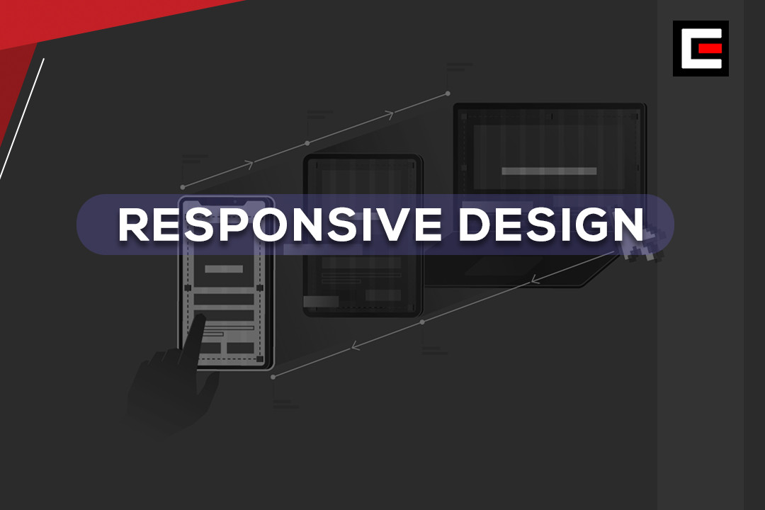
Responsive Design for Every Device
Create fluid, adaptable layouts that seamlessly adjust to any screen size, ensuring optimal user experience across all devices.
Create fluid, adaptable layouts that seamlessly adjust to any screen size, ensuring optimal user experience across all devices.
Responsive Design for Every Device ensures websites adapt seamlessly to any screen size, providing an optimal user experience across desktops, tablets, and smartphones. By using flexible grids, fluid layouts, and media queries, responsive design allows content to adjust dynamically, maintaining usability and aesthetic appeal. This approach eliminates the need for separate mobile versions, improving consistency and reducing development time. It enhances accessibility, supports touch-friendly navigation, and ensures faster loading times. Responsive design is vital in today’s multi-device world, helping businesses engage users effectively while boosting SEO rankings and catering to diverse audiences, regardless of the device they use.
FAQ area empty
 Eureka Admin
 English
 Certificate Course
 0 Students
 0 Student
 62 Courses
 1 Review
 Buy Now
